
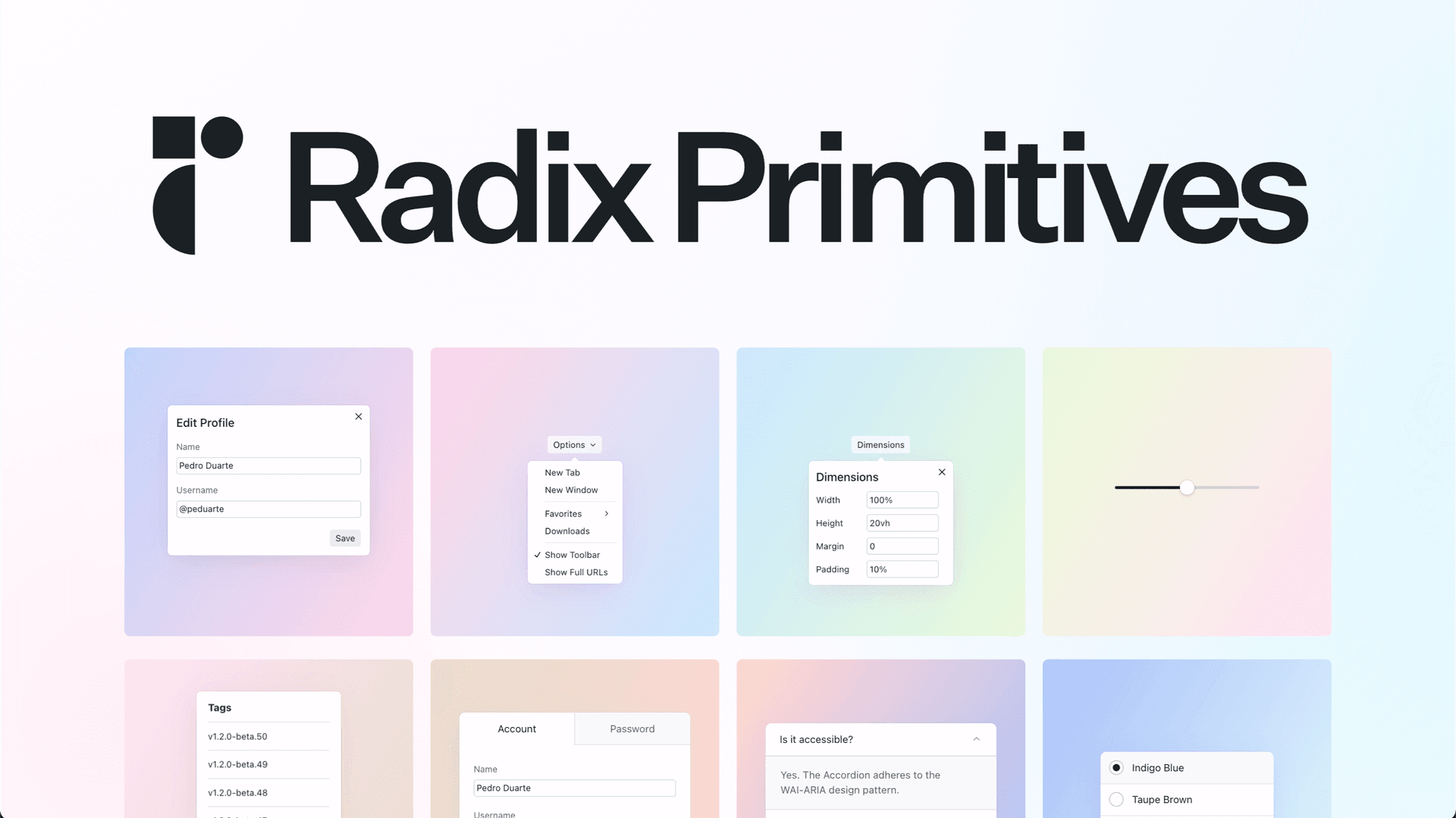
Radix UI is a popular React library to build accessible products. Here is a neat tip I found very useful.
Group tooltips
Use TooltipProvider to group all tooltips together, to get a better transition experience. See my demo (The brand color example isn’t grouped, the background color example is grouped)👇
Code example:
export function BackgroundColor() {
  return (
    <div>
      // ✅ Lift it here
      <TooltipProvider>
        <ul className="flex flex-wrap gap-x-6 gap-y-4">
          {COLORS.map(({ name, className, hex }) => (
            <li key={name}>
              // ❌ Don't use TooltipProvider here
              <Tooltip>
                <TooltipTrigger
                  className={clsx(
                    'h-7 w-7 rounded-sm border',
                    FOCUS_RING_ERROR_SHADOW_XS,
                    className,
                  )}
                  type="button"
                />
                <TooltipContent>
                  <p className="pb-1.5 text-xs font-medium text-gray-500">
                    {name}
                  </p>
                  <p className="text-sm font-semibold text-gray-600">{hex}</p>
                </TooltipContent>
              </Tooltip>
            </li>
          ))}
        </ul>
      </TooltipProvider>
    </div>
  );
}
Thanks to RadixUI’s consistency, this tip can be applied to many other Radix components as well, for example: hover-card.
engineering
Create your blogs directly from Apple Notes.
Say goodbye to complex CMS updates and management issues!
You focus on creating quality content while Quotion takes care of the rest.
Latest
More from the blog
Qing
applenotes
How to share Apple Notes and collaborate with others
Did you know you can share your notes with other iCloud users in Apple Notes? Besides, you can also collaborate with others to work on the same notes, everyone can see each other's changes. Let me show you how. Prerequisite You need an iCloud account and have to be logged in to your Apple device
Read post
Qing
applenotes
How to undo in Apple Notes
I like Apple Notes, it's easy to use, fast, and robust for note taking. Sometimes, you may make mistakes when typing, there are some steps to help you undo changes on all Apple devices. On iPhone or iPad Since the iPad version has a similar layout and features as the iPhone version, we use the
Read post
Qing
applenotes
Comprehensive Guide to Apple Notes Not Syncing
Sometimes, you may find that Apple Notes isn't syncing for some reasons. For example, you have written some texts on your iPhone, but they didn't get synchronized to your Mac. This is an infamous issue that happened to iCloud. You can find many similar posts on the Apple forum: Notes Not Syncing Across Devices iPhone
Read post